How Abhinav Bhagat Events Makes Wedding Maximalism Work
Ornament has a structure. A closer look at the colour, surface detail and repeated forms behind Abhinav Bhagat Events’ richly layered wedding settings.
5 minute read
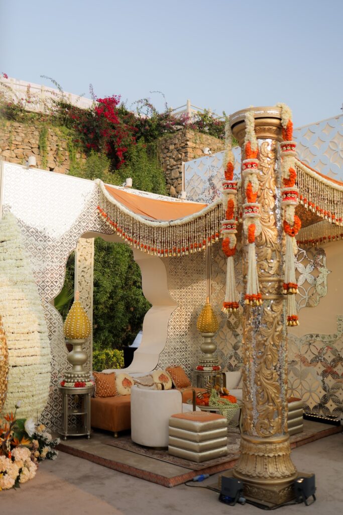
Decorated columns and floral swags frame a pale daytime setting.
Start With a Shape the Eye Can Follow
A pale column carries bands of ornament up towards a floral swag. Beyond it, the seating and decorative surfaces continue the same closely worked treatment. In this Abhinav Bhagat Events setting, there is plenty to look at. The column gives that abundance a visible structure, allowing the eye to follow a clear shape before it begins to register the smaller details.
That hierarchy is what makes maximalism interesting at a wedding. A space can contain flowers, patterned surfaces and elaborate objects while remaining easy to understand. The larger forms establish where attention goes. The closer details then give guests a reason to keep looking, particularly when they are seated long enough to notice more than the first impression.
The restrained ground colour matters here. It creates a relationship between the column, the backdrop and the furniture, while the flowers introduce smaller changes of colour. Several kinds of ornament can coexist because they have something in common. Their effect comes from the way they are arranged, rather than from each element asking to be the main event.
Abhinav Bhagat Events describes its design language as an interpretation of Indian heritage through a contemporary lens, with richly layered environments at its centre. This photograph gives that description a practical context. Familiar decorative references become parts of a wedding setting whose proportions, seating and focal points still have to work together. The detail earns its place through the whole composition.
Let the Surface Reward a Closer Look

A close view in the portfolio makes the relationship between those scales more apparent. Bird and botanical motifs extend across a raised decorative surface, with smaller patterns appearing below them. The relief catches light at its edges. What reads as a richly textured background from a distance becomes a series of individual forms when seen more closely.
For a wedding guest, that second view can be just as memorable as the first. A person waiting beside a seating area or standing in conversation encounters the setting at arm’s length. The finish of a border and the relationship between one panel and the next become visible. The design needs to remain persuasive at that scale as well as in a wide photograph.
This is where the studio’s combination of design and production becomes relevant. The studio owns inventory and builds what it designs. The editorial interest lies in what that connection can mean for a complete environment: a motif can be considered across several objects, and the larger proportions can be developed alongside their smaller decorative treatment.
A repeated floral shape, for example, can give a backdrop and a piece of furniture a relationship without making them identical. A border can introduce a line that appears elsewhere in the room. Those correspondences allow the setting to feel connected as guests move through it. Their value is in the continuity they create, rather than in how many times a motif can be repeated.
The wedding brief gives that continuity a personal direction. The studio places the client’s heritage, personality and setting within the design process. In a richly ornamented environment, those references need to become specific choices. A palette, a pattern or a particular kind of decorative form can establish a character that extends through the celebration. The abundance then has a point of view.
Give the Colour Somewhere to Go
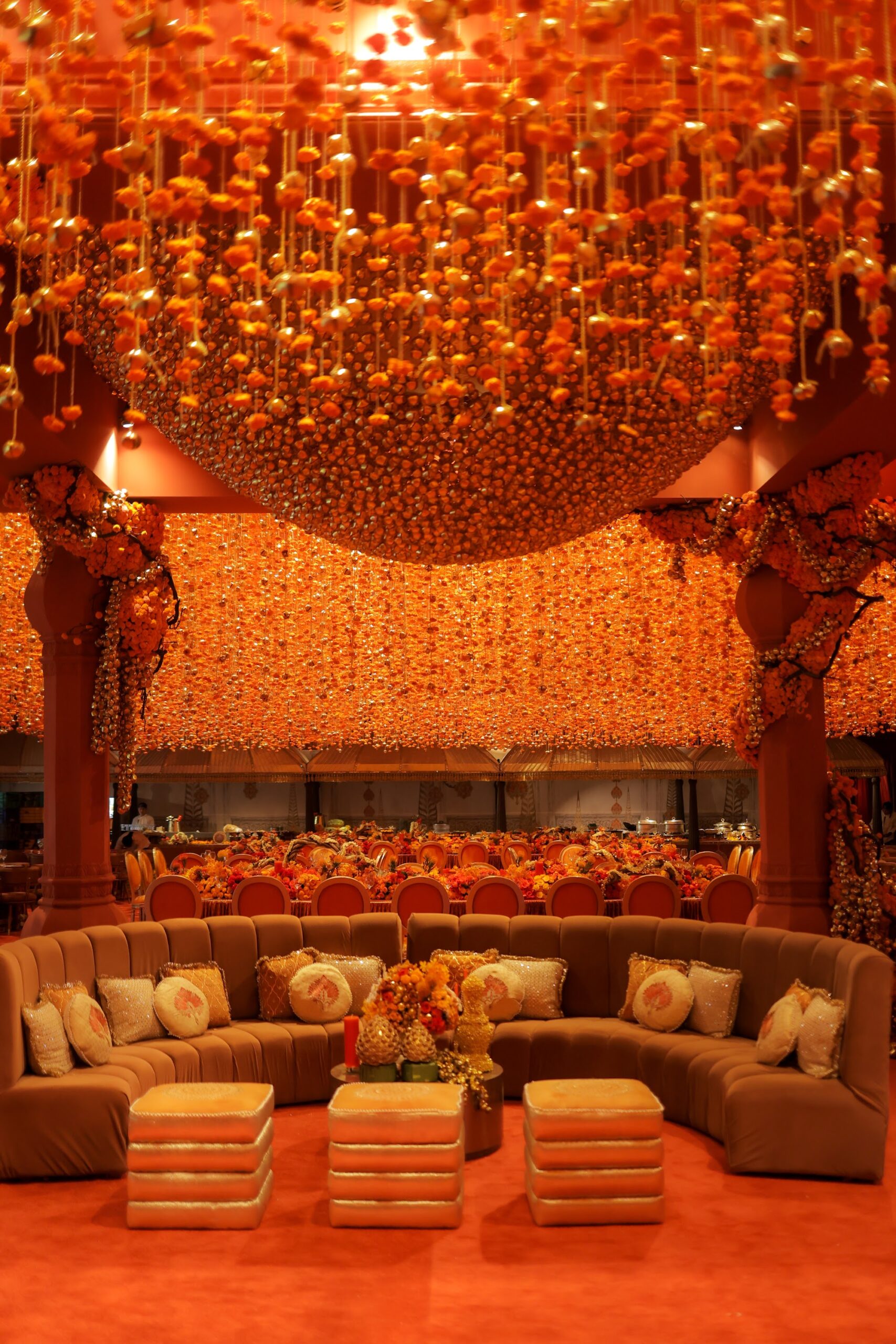
An orange interior takes the idea of coordination further. Floral strands gather overhead, patterned surfaces frame the seating and the furniture sits within the same warm family of colours. The palette is immersive. Its effect comes from being encountered above, beside and in front of the guest, giving the colour a spatial presence.
The photograph also shows why such a scheme needs changes of texture. A closely coordinated palette could become flat if every surface behaved in the same way. Here, the hanging strands, the fabric and the patterned treatment catch the light differently. Their relationships give the room depth even when the colours remain close.
At a wedding, this can create a distinct identity for one occasion within a longer programme. A daytime setting might allow a pale ground and flowers to establish its mood. Another room can explore a much more concentrated palette. The events need not repeat the same arrangement to share a sense of authorship. A consistent attention to proportion and finish can provide the connection.
There is a social dimension to that choice too. The seating area pictured within the orange scheme has a recognisable place in the room. The overhead treatment gives it atmosphere, while the furniture establishes where people might settle together. The decoration becomes part of the experience of occupying the space, continuing beyond the moment in which it is photographed empty.
The most persuasive part of Abhinav Bhagat Events’ maximalism is this movement between the grand view and the detail within reach. A strong shape gives the ornament a framework. A coordinated palette lets different textures register together. In the wedding setting, doing more becomes compelling when each element helps the guests understand and experience the same visual world.
Portfolio images supplied by Abhinav Bhagat Events.