The Wedding Website Becomes the Concierge
A thoughtful digital guest guide can bring the care of a good host to the journey, making a complex wedding weekend feel easier to enter.

5-minute read
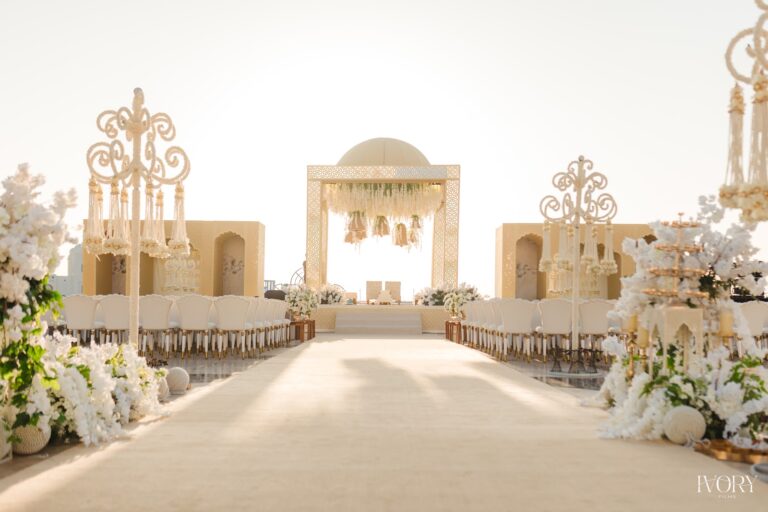
Illustrative photograph by Anete Lūsiņa / Unsplash.
The first question often arrives long before the invitation has been placed on a shelf. Which airport should a guest use, when does the welcome dinner begin and what does the dress code actually mean? At a wedding with several events, these details can become scattered across messages, attachments and half-remembered conversations. A well-designed wedding website offers a more composed introduction. It gives the guest somewhere dependable to return to, with the feeling that someone has already considered the questions likely to arise.
The interesting development is less about adding technology than giving it a clear hospitality role. Contemporary wedding platforms can bring schedules, travel details and responses together in one place. The couple and planner can then shape that information into an experience that feels personal, coherent and easy to use. For a luxury celebration, the website should behave like a discreet concierge: informed, concise and available when needed, without turning every interaction into another task the guest must learn how to complete.
Begin with the journey into the wedding
A guest arriving from another city reads information differently from someone who knows the venue well. The first needs a sense of the journey, while the second may simply want the time and entrance details for one event. A useful digital guide can serve both without becoming complicated. The most important facts should be easy to find from the opening screen. An elegant photograph may establish the mood, but the guest should not have to search through a long love story before learning where they are expected to go.
Travel information benefits from specificity. The correct property name, a clear location link and an explanation of any arranged transfer can prevent several avoidable conversations. If the ceremony and reception use different entrances or addresses, that distinction should be visible. The language can remain warm while being exact. A beautiful wedding begins to feel well hosted when a guest can make an ordinary practical decision confidently, rather than wondering whether a message received several weeks earlier is still the most reliable one.
The itinerary should reflect how the weekend will actually be experienced. Dates, start times and meeting points need a consistent format, with the destination's time zone made clear where guests are travelling internationally. Optional gatherings should look optional. A shared breakfast does not need the same visual emphasis as the ceremony. Giving the programme a hierarchy helps guests understand its rhythm, allowing them to see both the important moments and the intervals in which they can make their own plans.
Explain the invitation with care
A dress code is most useful when it communicates a mood and the practical conditions of the venue. Guests may appreciate knowing whether they will walk on grass, spend time outdoors or move directly from a ceremony into dinner. A few considered reference images can help, provided they illustrate possibilities rather than impose a narrow uniform. The guide should make people feel ready to join the celebration, with enough freedom to dress in a way that remains comfortable and recognisably their own.
Ceremonial information can be equally generous. A short explanation of an unfamiliar ritual, its approximate place in the programme and any relevant guest participation allows people to feel included. The wording should be checked with the family or person responsible for the ceremony, particularly when traditions are being brought together. There is no need to turn the website into a cultural handbook. A few accurate, welcoming lines can give guests the confidence to participate with attention and respect.
Responses deserve a similarly human approach. Attendance, meal preferences and other essential questions can be gathered in clear language, with a contact available for anything that needs discussion. Not every circumstance fits neatly into a form. A guest travelling with a child or seeking assistance may need a conversation. The digital guide works best when it makes that conversation easier to reach, rather than suggesting that the technology has replaced the people responsible for looking after the group.
Give the information an owner
A wedding website is only as reliable as the care given to its updates. Someone needs responsibility for checking the programme, confirming changes and ensuring old information does not remain in circulation. That person may work with the planner, family and transport team, but the guest-facing version should be consistent. Several people making independent edits can create confusion. A clear point of ownership allows the guide to remain calm even while the arrangements behind it continue to evolve.
Changes should be communicated according to their importance. A revised departure time needs direct attention from the guests affected; a new restaurant suggestion may simply be added to the travel page. Treating every update as equally urgent makes it harder for people to identify what matters. The website can serve as the current reference, supported by selective messages when necessary. This gives the couple a way to be helpful without filling every guest's phone with a constant stream of minor announcements.
Privacy belongs within the design from the start. Room assignments, individual travel details and smaller private gatherings should be shared only with the relevant people through appropriate channels. Some platforms offer guest-specific schedules or protected pages, but the planner still needs to choose and test the arrangement. The principle is simple: the right guest receives the right information. Discretion feels most natural when it is built into the experience rather than added in response to an awkward misunderstanding later.
Make the design feel like the wedding
The website can share a visual language with the invitation through colour, typography and a small number of motifs. It does not need to reproduce every printed detail literally. A layout that looks beautiful on a large screen may become difficult on a phone, where most guests will consult it while travelling. Readable text, clear buttons and a concise structure deserve priority. The design should carry the wedding's character while respecting the ordinary circumstances in which the information will be used.
An alternative should remain available for anyone who prefers a printed guide or direct contact. A compact itinerary at check-in can complement the website, and a named hospitality contact gives the digital experience a human connection. This is particularly useful across generations and languages. A wedding feels generous when guests can find their way through it in more than one manner. The technology succeeds when it reduces uncertainty for the group rather than dividing people by their familiarity with a particular interface.
On the wedding day, the best digital concierge may attract very little attention. Guests arrive at the correct place, know what to bring and understand whom to contact if plans change. They put their phones away because the practical questions have been answered. That quiet result is the point. A thoughtful wedding website extends the host's care into the spaces before and between events, giving the celebration something that elaborate production alone cannot supply: an easy beginning for everyone invited into it.